I’m really excited to bring you a new ‘Process Of Illustration’ post this week from someone whose work I greatly admire. I got to know Weylon’s fantastic work through connecting with him on Twitter and love the experimental way he approaches his work.
Without further ado, I’ll hand you over to Weylon…
Illustrator: Weylon Smith
Illustration: O Holy Night
This past fall I was asked by Fellowship Bible Church to create an illustration for stage background art based on the Nativity. The below describes the process of how I created the illustration.
My first step is to plan the composition by drawing a few thumbnails.
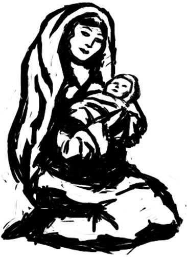
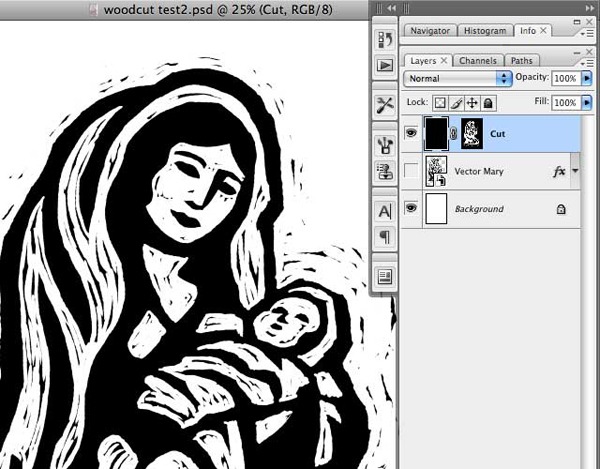
The style of the piece will be digital woodcut, which is a style I’m experimenting more and more with. I begin by doing a woodcut test just on Mary and the baby Jesus. Using the brush tool in Photoshop and my Wacom tablet, I rough out a sketch of Mary and Jesus. At this point, I’m more interested in shape than line. I “sculpt” each shape by making multiple passes, slowly correcting until I have a pretty good result.
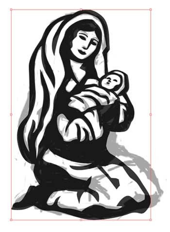
My next step is to place the image in Illustrator and trace over top of it with the pen tool. I could begin my woodcut directly in Photoshop, but this vector step is crucial—it forces my lines to straighten out a bit and become less curvy. It also establishes hard edges which I will work from in the next step. Traditional woodcut prints tend to have straighter lines than other types of printmaking because curves are difficult to cut in wood. It’s that aspect of a woodcut that I’m attempting to emulate in Illustrator.
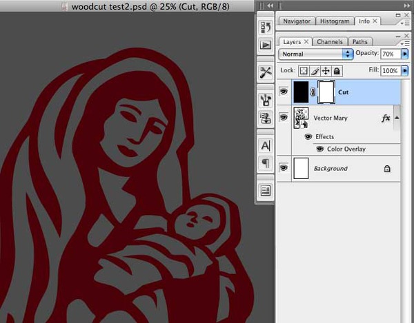
I place my vector Mary on a layer in Photoshop and add a Layer Style, Color Overlay of red. The color isn’t important—it just helps to identify my image area. I create a new layer directly on top of it and fill with black. I name this new layer “Cut”. I add a layer mask to the Cut layer and set the opacity of the layer to 70% opacity so I can trace the image below.
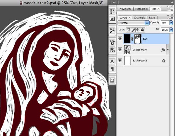
In order to achieve a rough hewn look (as if the knives were a little dull), I go to the brushes palette and set a size jitter of about 5%
With a hard brush and my foreground color set to black, I begin painting in the layer mask of the Cut layer, cutting everything away that’s not part of my image.
Once I’m done cutting around the “printed” area, I set my Cut layer to 100% opacity and turn off the Vector Mary layer.
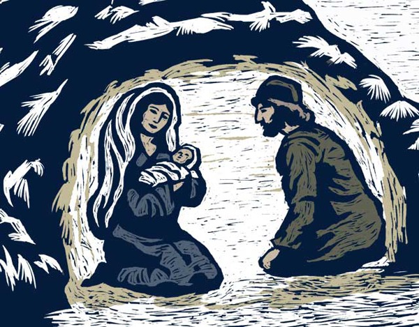
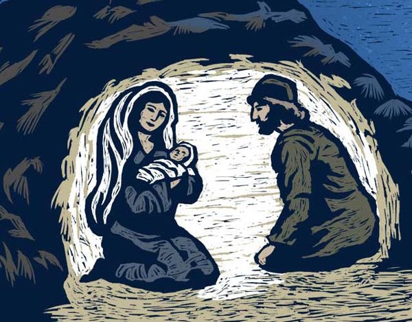
I start painting color on a new layer below my Cut layer, filling in details in the clothing. In this case, I decide that black was a little too harsh, so using Color Overlay, I change it to a midnight blue. I continue in this way until the entire piece is colored in.
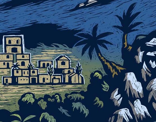
The final illustration.
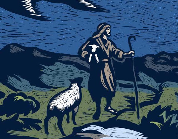
And some details:
About the Illustrator
 Weylon Smith is an illustrator and graphic designer based in Nashville, Tennessee. His work is primarily digital, but he often incorporates hand-made processes to create a look that evokes traditional media. He is the senior graphic designer at Fellowship Bible Church in Brentwood, Tennessee.
You can see more of Weylon’s work on his website and blog. You can also catch him on Twitter too.


